When it comes to building a strong, timeless brand, typography is everything. If you’re still at the stage of DIYing your brand, or beginning the process to find a brand designer, don’t miss these typography tips for building a high end brand.

But first, who am I to speak on typography?
I’m Emily, a brand and website designer, and owner of Emily Foster Creative, a branding studio that specializes in helping creative service based businesses get clear on their brands so that they can level up their online presence. We design custom brands and websites for everyone from marketing agency owners to wedding pros to photographers. You can check out our branding design and website design services here.

I sometimes think if it hadn’t been for a weekend typography workshop I took in college, I wouldn’t have decided to change my major to design. My main design professor in college was also obsessed with it, and coached my magazine design team and I to win a typography award in college for our editorial typography design treatment. To this day, it’s something I focus on quite a bit for my clients. And it’s one of the amateur mistakes I see when I see people DIYing their brands (it’s ok – we all start somewhere!) Here are 5 things you want to consider about typography when you’re building your brand:
1) One of the most underrated typography tips: please don’t recommend Canva fonts to your designer.
Canva is totally fine to use for your marketing materials, but not for building your brand. When it comes to building your core brand, it’s important that we build one that will be evergreen and easy to use across platforms. These aren’t licensed for use outside of Canva, and some of them can be pricy to use depending on what kind of license you need. It’s totally fine to get inspired with them, but when it comes to choosing web fonts or fonts to use across all your marketing, a designer might choose differently than Canva.
2) Pay attention to font licensing.
Did you know you need a different license for using your fonts online than you do in your logo suite? Make sure you have all the proper licensing so that you don’t get in trouble with a font designer down the road. This will often mean needing to pay for font licenses in order to use a custom font, or sourcing free fonts from Google Fonts (NOT Canva).
3) Pay attention to spacing in your typography design.
The space between letters (called tracking) and the spacing between individual letters (called kerning) really makes a difference to how your design looks. You’ll also want to pay attention to leading, which is the spacing between lines of text. Sometimes, more spacing can mean a more high end look, but it totally depends on the font.
4) Keep it simple and use no more than 2-3 font selections in your brand.
I recommend that most brands have more than 1 font, but I wouldn’t use more than 2-3. When you add too many, your brand starts to feel inconsistent, and we don’t want that because consistency builds trust with your ideal clients.
5) Your logo should be more than just typed out text.
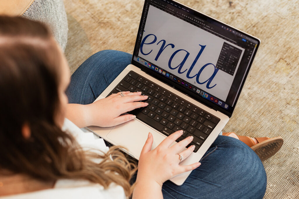
When it comes to your logo, that’s a different realm from your typography. We focus on designing only custom logos for clients, meaning that you’ll have a logo and brand that feels different from anyone else’s brand. In order to create a custom logo, we manipulate the vector points in a font, adjust spacing, or make other alterations in order to make your brand stand out.
6) Know your font families
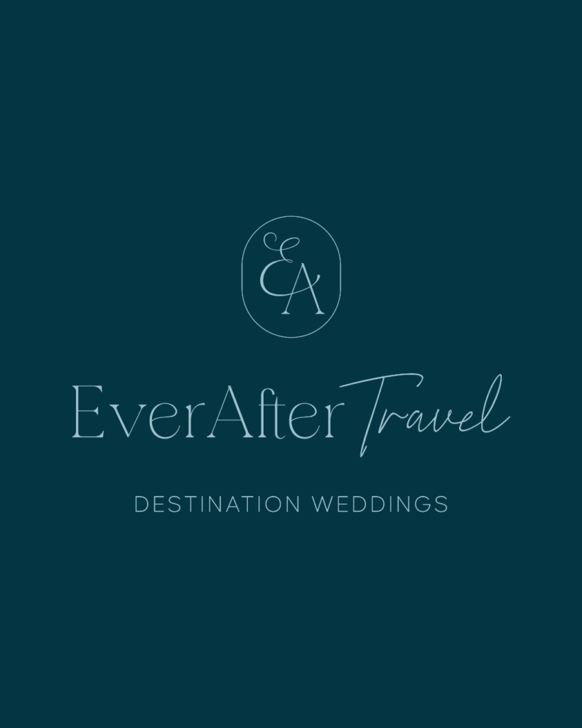
Ok, so if you’re not a designer, you don’t really have to know your font families in detail. But when a designer talks about a serif, they’re referring to a font that has little feet on the letters, kind of like the font used in the text that spells out “EverAfter” in the below logo design. A script font is usually a cursive or handwritten font like that used to spell out “Travel”, and a sans serif font is one like the text used to spell “Destination Weddings”.
When you’re building a timeless, consistent brand, one of my biggest typography tips is to combine font families, if it makes sense for your direction. For example, combine a high-end luxury style serif font with a modern sans serif for an elegant look, or consider combining a thinner font with a bold, chunkier font.

By being intentional with your typography selections and treatments, you can create a luxury brand, or evoke a different feeling that you’re going for!
Want insights on whether your fonts are working for you? You can book a branding and website audit here:
Leave a Reply Cancel reply
We respect your privacy.
Copyright Emily Foster Creative, LLC. 2021 - 2025. All rights reserved.
hello@emilyfostercreative.com
Brand photography by Lena Crocker Photo, Ciara Corin Photo, Moon & Honey Photography and Enliven Photography
Powered by podcasts and tea.
Designing out of Portland, Oregon for creatives around the world.

Be the first to comment