

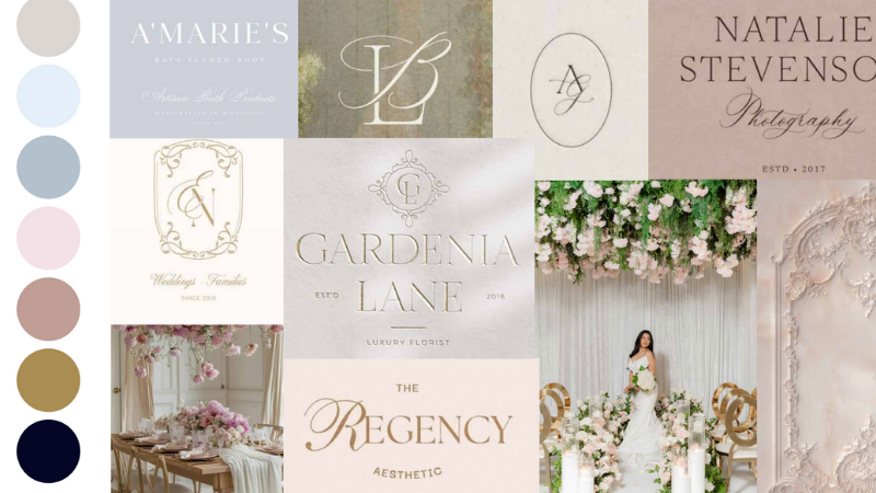
Luxury Brand Color Palette: Beyond Neutrals
If you’re building a luxury brand color palette, you’re already thinking about standing out — but the real question is: are your colors working for you, or working against you?
🎧 Listen to this episode on Spotify, Apple Podcasts, or right HERE.
Why Color Strategy Matters More Than You Think
Color is often underestimated in the branding process — yet it plays one of the most powerful roles in shaping first impressions. In fact, up to 90% of a client’s first impression is influenced by color alone. That’s huge.
But here’s the thing: most creative entrepreneurs choose their colors based on personal taste, industry trends, or even what their competitors are doing. Very few choose their brand palette with intentionality rooted in strategy, psychology, and long-term positioning. If you want to build a luxury brand — a brand that commands attention, trust, and premium pricing — your color palette needs to be doing heavy lifting. Every shade you use should be saying something specific, aligning with the experience you offer, and visually reinforcing your values and tone of voice.
If your colors aren’t currently doing that, it doesn’t mean you’ve failed. It just means it’s time to realign — and this guide will walk you through exactly how to do that.
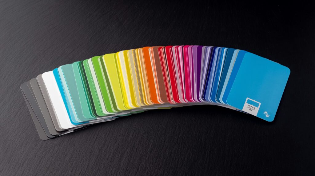
Luxury Doesn’t Mean Black and White Only
There’s a long-standing misconception in the creative space that luxury branding = black, white, and beige. And while those tones can absolutely be part of a refined visual identity, they’re not the only path to luxury.
Luxury isn’t about removing personality. It’s about curating it. True luxury design is built on clarity, intentional contrast, spaciousness, quality materials, and emotional resonance. That’s where color can shine — especially when paired with strong visual balance and thoughtful typography.
The truth is, we’ve all been conditioned by the Pinterest era to equate minimal neutrals with sophistication. But brands like Tiffany & Co., Hermès, and Cadbury prove otherwise. These are globally recognized luxury brands that lean into rich, bold color — but do it in a way that feels timeless, not trendy.
So if you’re someone who loves color, I want you to feel empowered to use it. The goal isn’t to strip your brand of personality in the name of elegance. The goal is to infuse your brand with clarity and character — and color is one of the best ways to do that.
Color Psychology: What Your Palette is Really Saying
Color speaks long before your copy does. That’s why it’s important to understand not just what colors look like, but what they communicate. This is where color psychology comes in.
Think of deep blue — it’s used by healthcare systems, insurance brands, and trusted tech companies for a reason. It communicates stability, trust, and calm. That’s why it’s also incredibly popular in the luxury wedding space. When paired with gold, it evokes classic refinement.
Gold itself represents tradition, opulence, prestige — but it has to be used with restraint. If overused, it can feel flashy instead of sophisticated. Used as an accent? It adds elegance. Used as a background? It might overwhelm.
Blush and mauve tones bring in softness, femininity, romance. Green can evoke feelings of wellness, growth, wealth — especially darker greens, which signal heritage and strength.
Every brand should ask: what emotions do I want to evoke at a glance? Your color palette should help answer that question — before anyone reads your tagline.
Your Palette Needs More Than Pretty Hues
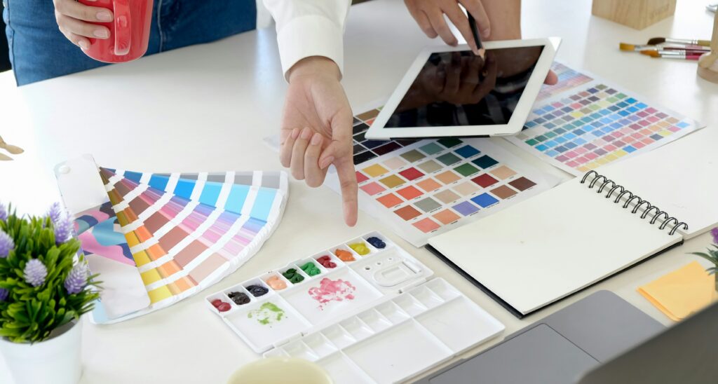
Let’s talk function. It’s easy to fall in love with a set of pretty colors, but when it’s time to actually use them across your brand, the challenges appear. Maybe text is hard to read. Maybe every Canva post looks slightly off. Maybe your Instagram grid lacks cohesion.
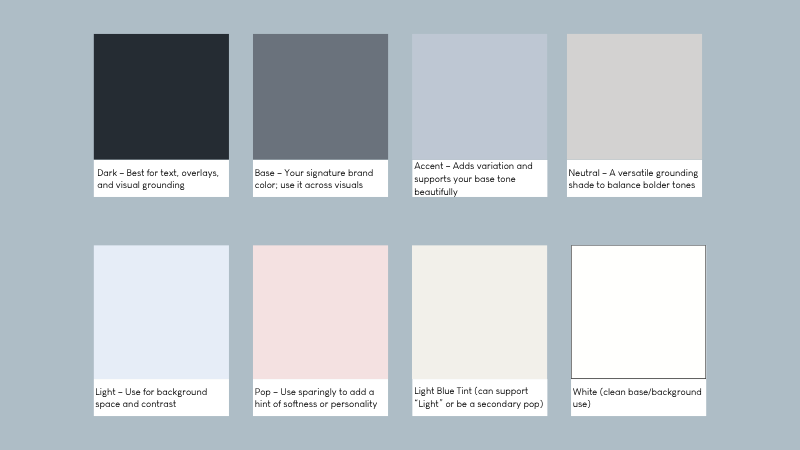
That’s why I recommend building a functional palette that includes six types of colors:
- Base: This is your core brand color. It should appear frequently and feel iconic to your brand. Think of it as your “signature shade.”
- Accent: Adds visual interest and variation. It supports your base color and creates flexibility.
- Dark: Used for text, overlays, or visual grounding. This could be navy, black, dark brown, or deep green.
- Light: Creates space and contrast. Essential for backgrounds and readability.
- Neutral: Keeps your palette grounded. Think cream, warm beige, or a cool gray — something that supports rather than competes.
- Pop: A bold, unexpected color used sparingly for emphasis or personality.
These aren’t just arbitrary categories — each plays a specific role in keeping your design cohesive, functional, and elevated. A well-structured luxury brand color palette gives you the visual vocabulary you need to show up with consistency, clarity, and professionalism.
Your luxury brand color palette doesn’t just make things pretty — it builds trust with every click, scroll, and first impression.
What the Luxury Client Actually Sees
High-end clients don’t just look at your brand — they analyze it, consciously or not. Your color palette is one of the first indicators of whether your brand feels professional, polished, and trustworthy. It instantly creates emotional cues.
The luxury client wants to feel confident in who they’re hiring. They want to trust your taste. They want to feel like they’re in the hands of someone who gets them. If your colors look like they were pulled from a mood board without thought, they’ll sense it.If you want to build a luxury brand…your color palette needs to be doing heavy lifting.
Your brand should be giving them clarity, not confusion. That starts with visuals — and color is the front door.
You Can DIY This — With Guardrails
Designing your own color palette is absolutely doable — but it requires boundaries. Most brand chaos comes from a lack of parameters. One day you’re using blush and cream, the next it’s teal and gold, and suddenly your entire feed looks disconnected.
Here’s how to DIY with confidence:
- Create a visual reference guide or brand board for quick access
- Set clear rules: which color is for text, which for buttons, which only in backgrounds
- Test readability on every color combination
- Avoid adding more than one “pop” color unless it fits the strategy
- Check consistency across devices (colors look different on screens!)
Having rules around how your colors are used is the difference between a cohesive DIY brand and one that feels disjointed.
What Happens After You Choose Your Palette?
Choosing your colors is just the beginning. Implementation is where the real brand-building begins. A luxury brand isn’t just about what you see once — it’s about what you consistently recognize everywhere.
Make sure your new color palette shows up:
- On your website and mobile version
- Inside your lead magnets and PDFs
- In your Instagram highlights, story templates, and Reels covers
- In your welcome guides, contracts, and email banners
- On your Pinterest graphics and ads
The more consistently your brand colors appear, the more authority and recognition you build.
Real Talk: Mistakes I See All the Time
Let’s normalize outgrowing your original color palette — but let’s also recognize when your colors are holding you back.
Here are a few of the biggest mistakes I see in luxury branding:
- Basing your palette solely on trends: Just because terracotta was everywhere in 2022 doesn’t mean it’s the right fit for your long-term brand.
- Choosing colors you personally love but your audience doesn’t connect with: You are not your ideal client. Make decisions for them.
- Not prioritizing contrast: If your website has blush text on a cream background, it might look soft — but no one can read it.
- Being overly minimal: A black/white/gold palette with no warmth or variation can quickly feel generic.
- Inconsistency across platforms: If your IG feels vibrant but your website is beige and sparse, your brand feels unreliable.
Mistakes happen. The good news? You can fix them. And the first step is bringing intention back into your brand visuals.
Stand Out in a Sea of Beige
If everyone in your market is using neutral tones, then your carefully curated pop of color becomes your competitive edge.
In saturated markets — like wedding planning, floral design, and photography — color can become your visual signature. Think about how a specific shade of deep emerald or dusty lavender could become associated with your brand over time. The more you show up with that color, the more memorable your brand becomes.
So don’t play it safe to “look luxury.” Play it smart — and let your colors help you stand out for all the right reasons.
The Palette Isn’t Everything — But It’s a Powerful Start
Color is one piece of a multi-layered brand experience. But when chosen and implemented well, it unlocks alignment across all your other visuals.
Your font choices, website layout, image styling, packaging, and even your client gifts — all of it flows more smoothly when you’ve defined your core brand colors. That visual clarity empowers your team, your designer (if you’re working with one), and most importantly — your clients. It makes you look put together. And that’s what they’re buying.

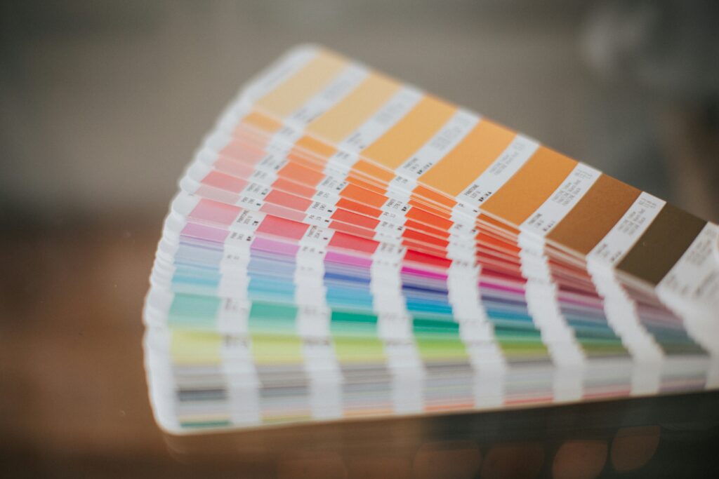
How Many Colors Is Too Many? Let’s Talk Balance
There’s no magic number, but I always recommend staying within 4–8 colors. That’s enough to give you variety and flexibility, but still maintain visual consistency.
More than 8? You run the risk of visual noise — your brand starts to feel chaotic. Fewer than 4? You might find yourself constantly reaching for “off-brand” colors just to complete a design.
Instead of adding more colors to make things look “fresh,” get creative with how you use the ones you’ve already chosen. Adjust tone, size, layout — but keep your color system tight. That’s what makes your brand memorable.
When to Rethink Your Palette (And How to Know It’s Time)
You’ve evolved — but your brand visuals haven’t. That’s the number one sign it’s time for a color refresh.
Other signs? You’re seeing low engagement. Your website doesn’t feel aligned with the kind of clients you’re attracting. Your visuals feel scattered. You cringe when you send people your link. Or your brand materials don’t feel like a match across platforms.
Revisiting your color strategy isn’t starting over. It’s a growth move. And if done right, it can help you step confidently into your next season of business.
How Color Affects Your Brand Perception on Social Media
Most couples (and corporate clients!) will see your brand first on social. That first scroll-through? It matters.
Cohesive, intentional color makes your feed instantly feel elevated. Whether you’re using muted neutrals or bold accents, what matters most is consistency. Pick a filter, pick a tone, and stick with it across your imagery and design.
When your content visually aligns — in palette, in layout, and in tone — people stop scrolling. And that attention is what gets them into your DMs and inquiry forms.
Don’t Forget Typography and Imagery — They Have to Match the Mood
Even the most beautiful color palette will fall flat if paired with fonts that feel outdated or photos that lack cohesion. Color doesn’t exist in a vacuum — it works alongside typography, layout, and photography to shape your overall aesthetic.
Ask yourself: do my fonts feel aligned with my palette? Is my photography reinforcing the same mood my colors evoke? Am I pairing soft colors with overly chunky fonts, or bold tones with generic images?
Luxury branding is about unity — and your visuals should feel like they’re speaking the same language, all the time.
Still Unsure Where to Start?
I’ve got you covered. Whether you’re DIY-ing or hiring support, here are your next steps:
✔️ Download my Free Brand Color Guide — it’ll walk you through building your palette with color psychology and clarity.
✔️ Want more depth? Grab the Luxury Brand Workbook — a step-by-step resource to align your whole brand visually.
✔️ Need a strategic eye? Book a $300 brand strategy session — you’ll leave with clarity, confidence, and an actionable direction. Plus, if you book a full project later, you’ll get $100 off.
If you’re overwhelmed or not sure if your current look qualifies as a true luxury brand color palette, that’s exactly what these tools are for.
🎧 Ready to go deeper? Hit play above to listen to this episode on Spotify, Apple Podcasts, or right HERE on the blog. Let’s make your brand unforgettable — one perfectly chosen color at a time.


Be the first to comment