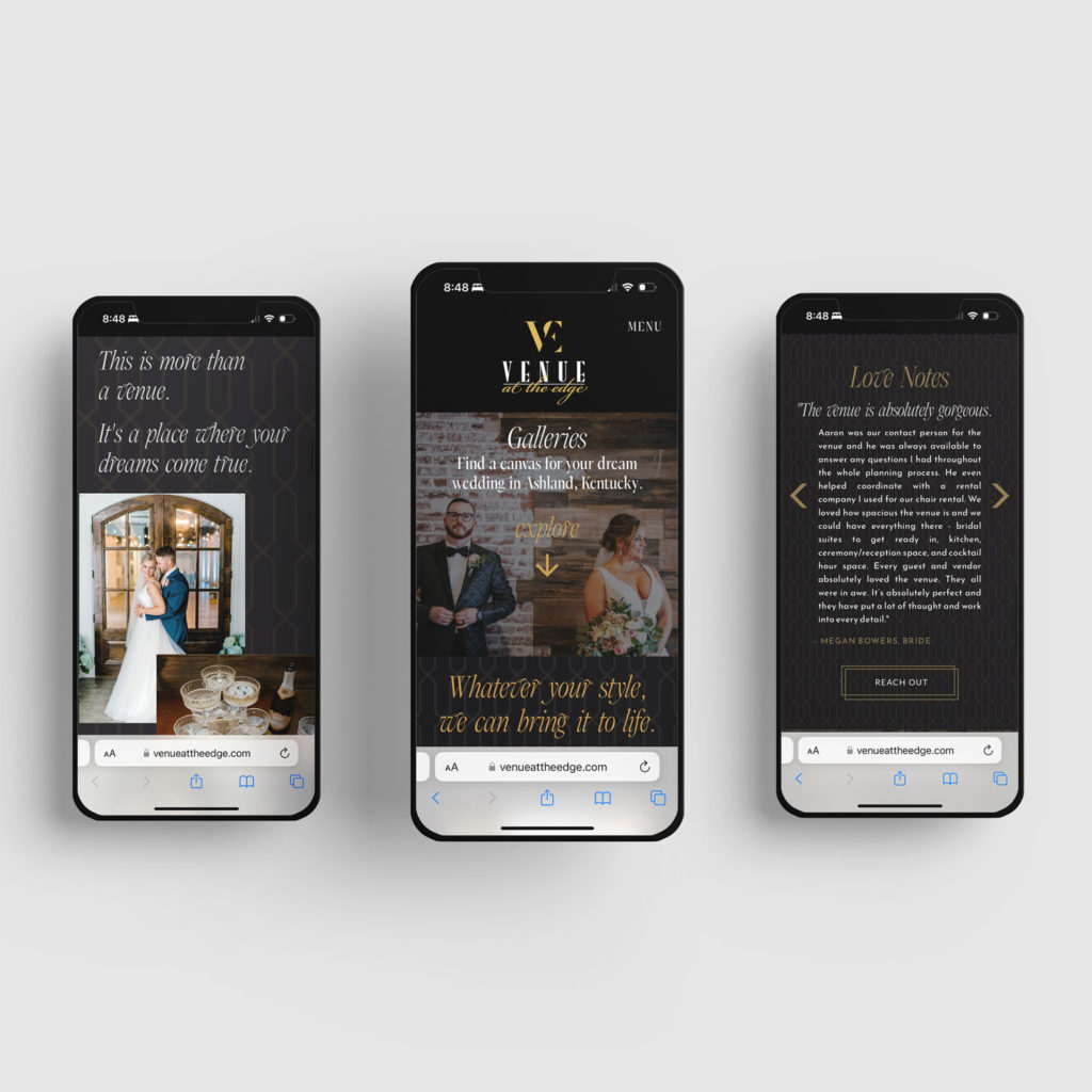
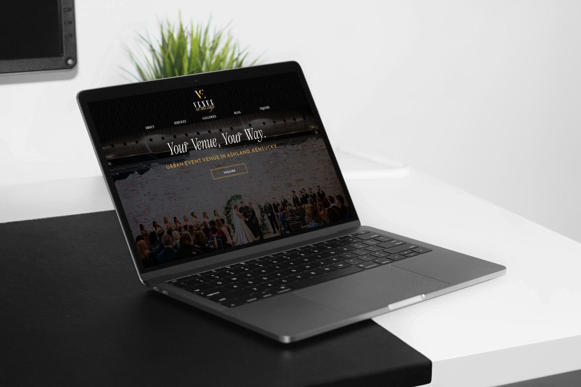
Case Study: Venue at the Edge’s Custom Showit Website
Working on a custom Showit website allows you to stand out by having a website that’s catered to your business’s unique story and needs. Through our 1-week and 2-week intensives, we’re able to customize a website to your goals to enhance your online presence. While we also offer website templates and Showit website template customizations, there’s just something about a custom Showit website that stands out.
We loved working with Venue at the Edge to build a custom Showit website, tailored to their branding and strategy.

The Problem
Lauren from Venue at the Edge reached out to us in 2022 because they wanted to elevate their website presence. I was excited to see that they were already using Showit, and Lauren knew quite a bit about the platform, so much so that she had designed a nice looking website.
From a business standpoint, the venue wasn’t getting enough inquiries, and when they were having couples book venue tours, they were finding that their pricing or style was outside of the couple’s budget and idea for their wedding. In addition, they were booking couples who weren’t aligned with their ideal wedding styles and values.
The Brand Strategy and Branding
Before we began Venue at the Edge’s custom Showit website, we worked on their brand strategy and branding identity. You can read more about that leg of the project here. We essentially did a brand refresh, keeping their original primary logo, and expanding off of it with refreshed colors and typography, and additional brand assets like secondary logos, patterns, and icons.
The Website Strategy
After discussing brand strategy and goals, we talked through how many pages the website needed and what the flow of the website should be. Because this was an intensive project and not a full-service project, we didn’t start from complete scratch with a wireframe, but we did customize the website completely in Showit, not sticking to a structured template.
Website Design Details
In terms of aesthetic, we focused on geometric details, like photos cropped at an angle and incorporating the brand’s patterns.
We added line accents to the buttons to create an extra detailed look. This helped add consistency to the site and gave it an elevated, luxe look.

That Extra Touch
We really wanted to elevate the user experience on Venue at the Edge’s website, so we made the Services page an interactive “choose your adventure” experience. Visitors can select the type of wedding experience they’re looking for and be directed to the venue package that would be best for their interests.

Search Engine Optimization
This website package included basic on-page SEO and we focused on using keywords centered around “Asheville, Kentucky” to attract local clients. We made sure to optimize all of the photos by running them through an image compressor, Tiny PNG, before uploading them.
The Results
We were all impressed to hear that Venue at the Edge was able to book 6 new weddings soon after their website launch.
In addition to these measurable results, Venue at the Edge walked away with so much more confidence in their website, feeling confident to share their website with vendor partners and on social media.
Investing in their branding and custom Showit website really made a big difference for Venue at the Edge’s business. If you’re in a similar position as they were, and ready to finally have a website you’re proud to show off, reach out and we can talk about how to get you to your end goal.

Leave a Reply Cancel reply
We respect your privacy.
Copyright Emily Foster Creative, LLC. 2021 - 2025. All rights reserved.
hello@emilyfostercreative.com
Brand photography by Lena Crocker Photo, Ciara Corin Photo, Moon & Honey Photography and Enliven Photography
Powered by podcasts and tea.
Designing out of Portland, Oregon for creatives around the world.

Be the first to comment