Case Study: custom branding for a wedding venue
We had the privilege to design branding for a wedding venue in Kentucky. Lauren from Venue at the Edge reached out to us near the end of the summer in 2022 and felt that their website needed to be elevated. While it was already designed in Showit and looked nice, Lauren felt that it was only doing so much for them.
Venue at the Edge is an industrial-style venue located in Asheville, Kentucky. They are known for their dark and moody lighting, brick walls, and flexible space. While many of their couples enjoy planning edgy, moody weddings, the space is really a blank space for any kind of wedding or other event.
Venue at the Edge booked one of our intensives where we worked on custom branding and a custom Showit website. We love intensives because we’re able to deliver custom branding work in a short timeframe for clients. Our intensives normally include a semi-custom site, meaning that we start with a template and customize it to our client.
Why invest in branding for a wedding venue?
With so many wedding venue costs, it can be difficult to prioritize. Branding is an excellent way to elevate your wedding venue’s marketing, and Lauren and the team realized that. Venues are often the most expensive investment for couples planning a wedding, so it’s important that your wedding venue’s brand stands out as professional and catered to your ideal client.
The Problem
The venue wasn’t getting enough leads, and when they were having couples book a tour, they were finding that their pricing was outside of the couple’s budget. In addition, they were booking couples who weren’t aligned with their ideal wedding styles and values.
The Brand Strategy
Prior to Venue at the Edge’s design intensive, we met to talk through their brand strategy. We discussed their mission, values, and goals. One big goal was to attract more wedding couples who align with their unique style and price range.
We talked through their client archetypes and built a client profile on a modern young couple looking to plan a big party to celebrate with all their family and friends.
The Mood Board
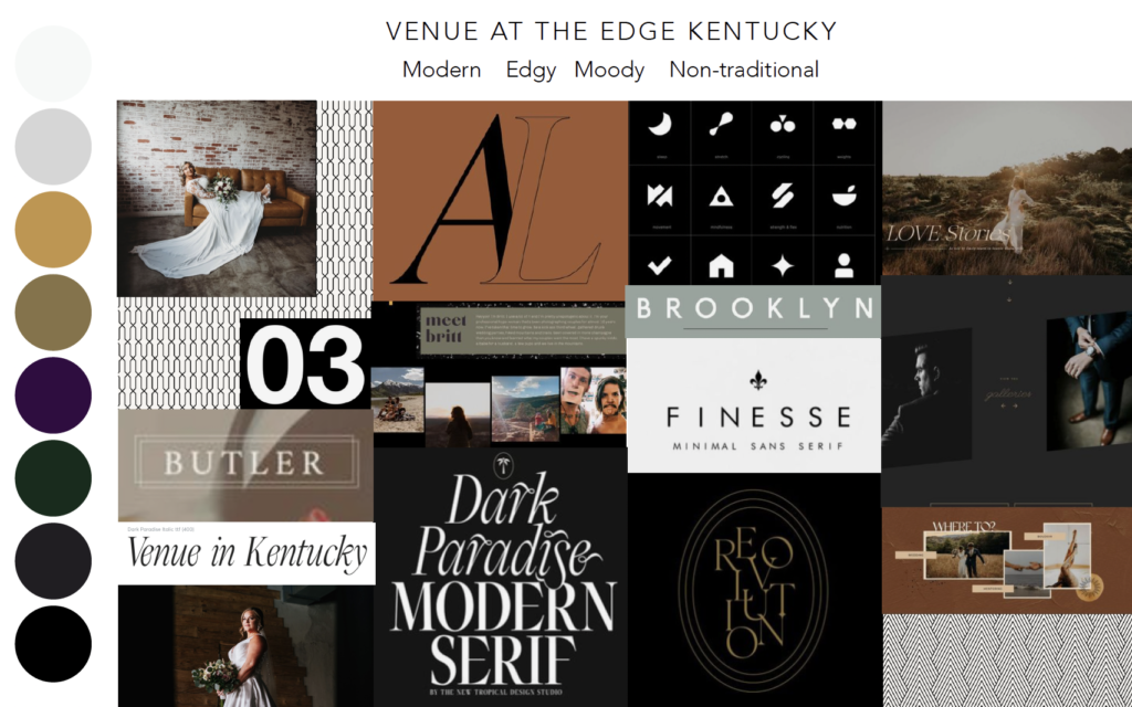
Below is the mood board that we put together for their project. The mood board is essential to expressing the stylistic direction that we plan to design the branding in. Spoiler: Lauren loved it!
For our mood boards, we look for inspiration from sites like Behance, Pinterest, and more. We always record a Loom video to present the concept to clients, and make sure to point out that we are not going to copy the designs of anything featured, but mix styles in a way that is strategic and uniqe to the client. We also tend to include photos from our clients’ websites. In this case, we chose photography from their photographer partners that featured the style of weddings they wanted to book more of.
The Logo Designs
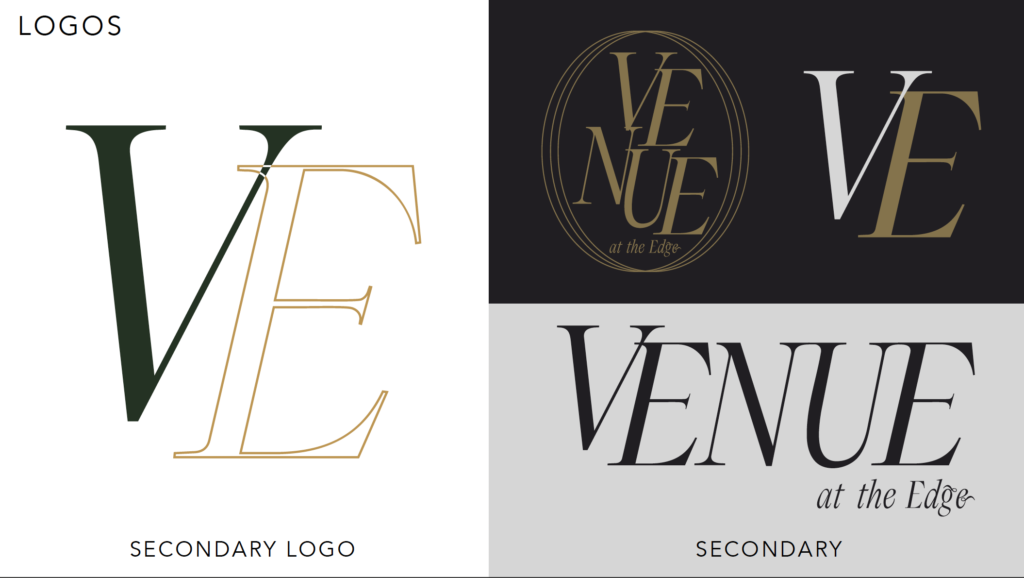
This custom branding project served as a brand refresh for the venue. The main reason that we didn’t redesign their logo was because they had already painted their primary logo on the wall. We felt that their primary logo was already professional and in-line with their brand strategy, so agreed to design additional branding assets, like their secondary logos, icons, and patterns.
The Color Palette
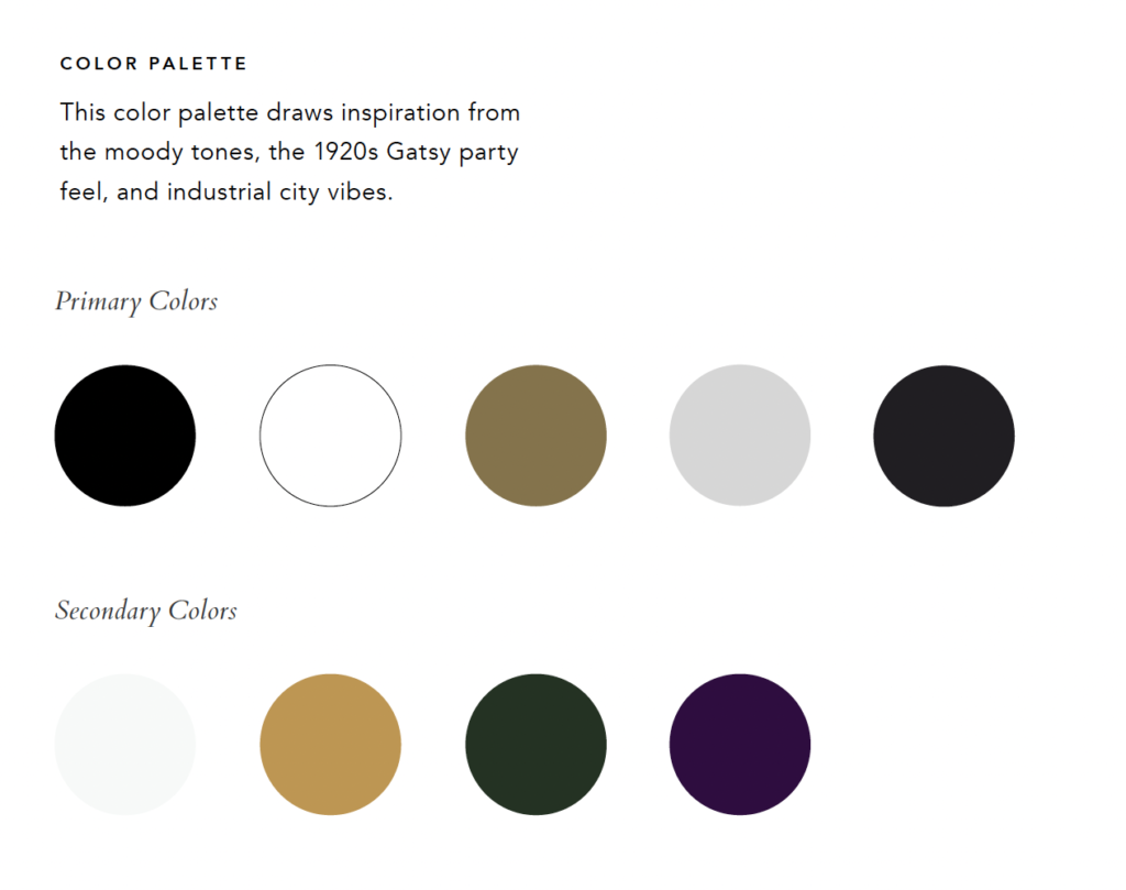
We are in love with Venue at the Edge’s color palette (really, we love it all, but the color palette was outside our standard design style)! As a branding studio, we are always looking for ways to push the line with our design style and to make each client’s project stand alone as a unique piece of art. And of course, the art must also work for their strategy.
We chose a dark and moody color palette that aligned with the industrial, modern style we were going for. The dark green and purple brought in a little color, which is a signature element of the Emily Foster Creative style, but were dark enough to still feel on-brand.
The brighter, more orange gold is their original gold, which we decided to leave in the palette in order to tie in their current logo design. We also modified the original gold just slightly to give the brand a facelift – we toned down the saturation to fall more in line with the rest of the palette.
The Brand Typography
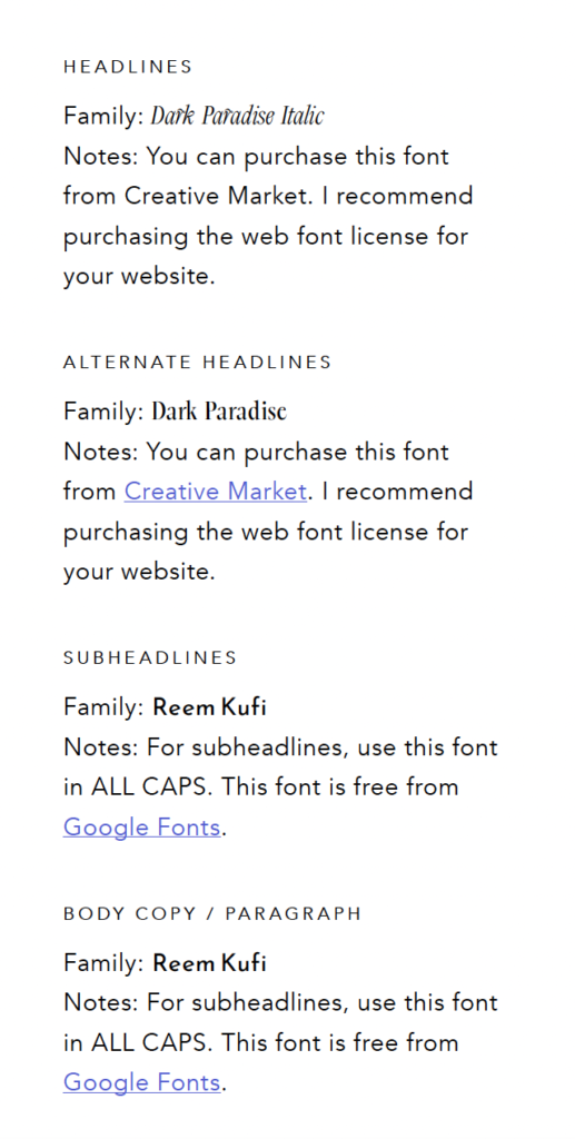
We ended up purchasing a license for the Dark Paradise font featured in the mood board. We focused on a mix of luxe, stylish serif fonts with modern, geometric sans serifs.
The Icons and Patterns
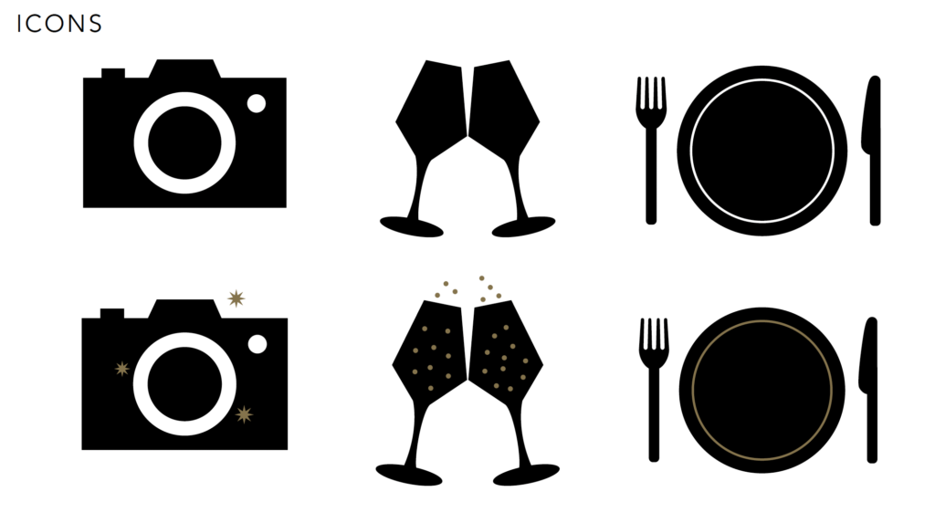
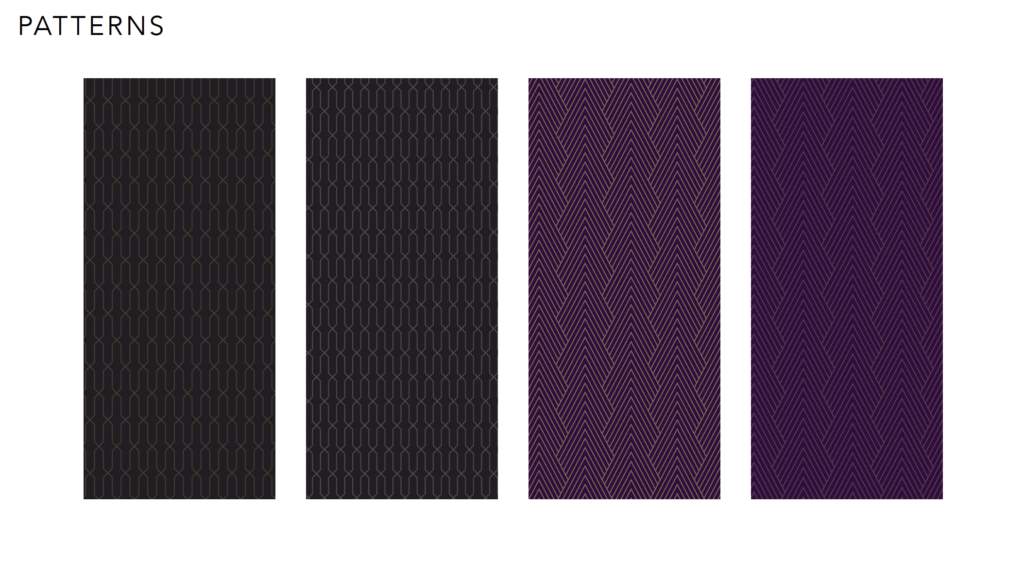
We looked to geometric styles for the patterns and minimalistic, Scandinavian styles for the icons. We Think Adidas’ masculine, minimalistic style to their brand icons. While Adidas has nothing in common with Venue at the Edge, we often use this type of inspiration within branding projects. We look for connections between entirely different industries to design branding that stands out and is unlike the branding of our clients’ competitors.
For the patterns, we purchased a geometric pattern pack from Creative Market then customized it to the client’s colors.
To end a branding project, we always provide clients with a style guide.
The style guide includes the brand’s color codes, tips for using the logos and other brand assets, and directions for where to find the typography.
The custom Showit Website Design
We designed a custom Showit website for Venue at the Edge. Read the full blog post on the website design here.
This website package included basic on-page SEO and we focused on using keywords centered around “Asheville, Kentucky” to attract local clients.
The Results
Lauren and the team at Venue at the Edge instantly felt more confident in showing off their branding to the world! Here’s what they had to say:

Venue at the Edge also booked 6 new weddings quickly after their website launch. We are always thrilled to see our clients get these results!
You can view the full Venue at the Edge project here. We loved working with Lauren and the team, and can’t wait to see their business continue to thrive.
Leave a Reply Cancel reply
We respect your privacy.
Copyright Emily Foster Creative, LLC. 2021 - 2025. All rights reserved.
hello@emilyfostercreative.com
Brand photography by Lena Crocker Photo, Ciara Corin Photo, Moon & Honey Photography and Enliven Photography
Powered by podcasts and tea.
Designing out of Portland, Oregon for creatives around the world.

Beautiful ideas! It definitely gives me moody, which I love 💕
Thank you so much! The moody vibe is so fun. 🙂