Branding and Website Design for a Furniture & Countertop Design Business
A brand and website design that tells your business’s story is essential. When Rick from Ye Olde Finish Shoppe came to me, he wasn’t getting enough potential clients to find him through his website and his branding didn’t truly speak to his company, experience, or his story. He needed intentional branding to tell his story, and a website that was attractive and functional.
Ye Olde Finish Shoppe was new to its area at the time – Rick had moved from the Napa Valley to southern Oregon. One of his business’s biggest pain points was finding the right clients who would want to pay premium prices for his luxury-feel countertop, furniture, and charcuterie board designs. In a world full of businesses who can do quick work, Rick needed to be perceived as the expert artist he is. He wanted and needed to get traction from clients who appreciate art, like the charcuterie boards and epoxy resin countertops he designs.
Brand Strategy
Each of my branding packages includes an initial brand strategy call, or project kick-off. During our initial brand strategy conversation, Rick and I discussed how each of his pieces is unique. From countertops to charcuterie boards, no two designs have ever been the same. In addition, Rick’s work is sustainable and focuses on using materials from his environment. We talked about how his charcuterie boards incorporate local grasses, leaves, and wood. He had even used old potato crates to create a decor piece in the past.
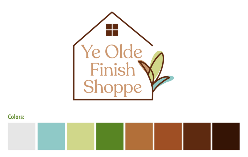
Going into the project, I knew I wanted to find a way to speak to the sustainable aspect of his business, while giving the brand a luxury, premium feel.
In addition, we needed to come up with a way to communicate to potential clients exactly what Rick does and, well, what they could pay him for. Condensing countertops, furniture design, decor, and charcuterie boards into one theme, we came to the conclusion that all of his pieces are functional and realistic in nature, yet they’re unique and enhance the look of a home in some way. Each piece that Rick creates speaks to his customer’s home, and each countertop design is made to match the unique colors and feel of their kitchen or bathroom. Through the brand strategy, we came up with his tagline: Functional artistry.
Logo/Branding Design
When I start a logo design, I don’t even touch the Adobe Creative Suite to begin with. First, I seek inspiration for what I want the feel of the brand to be. I put together a moodboard to give my client an idea of what their brand will look like. It includes a typography feel, color palette, imagery, and graphics inspiration. Even if the typography and colors aren’t the final selection, having this direction steers the project and helps communicate to my client what they can expect. I always talk about this look and feel with a client in my initial Brand Kick-off call, so there’s no surprise about the direction. To learn more about my process, you can inquire about your project here.

After the moodboard is sent to the client and we determine that the direction is spot on, I have fun drawing. This is my favorite part! I love to open up a sketchbook and draw whatever my mind can come up with related to the brand’s direction. I’ll often start with key elements. For example, with Ye Olde Finish Shoppe’s project, I started drawing houses, tools, trees, leaves, and charcuterie boards. I also draw out options for how we could play with the text in a logo. Through this process, I narrow down the best options, then make them digital.
Once digital, I play with a variety of design aspects, from different fonts, line thicknesses, colors, and more. More refinement happens during this process, and I get an idea for which options feel most authentic to the brand.
My brand packages include 1-3 logo options. I don’t promise my clients a specific number, because I always have an idea of which logo option will work best for their brand. If there are a couple solid options, I’ll show my client and allow them to choose what feels most authentic to them.
Once we’ve established the final logo and refined the branding, we can move on to the website! You can view some examples of my branding here.
Website Design

After designing the logo and thinking strategically through what Ye Olde Finish Shoppe’s branding should look like, I dove into the brand’s website design. A typical web design includes three phases:
1) Establish the main goals of the website.
Does my client need to get more inquiries? Do they need to communicate something specific about their services/products? Do they need to sell products through the site? The answers to these questions determine every decision we make with the website.
2) Put together a wireframe:
A wireframe is basically a map of how your website will flow and gives an idea of how potential customers might navigate through your site. It includes which pages will be displayed in your menu and in what spots there will be buttons to link to new pages. This is one of the most essential aspects to a web design, and one of the reasons why hiring a strategic web designer will benefit your brand greatly.
3) Design, design, design!
After a wireframe is approved by the client, I design the website, and incorporate the branding we’ve already established. Clients don’t have to book a branding package in order to get a website design with me, but it is very beneficial to ensuring that a website design is as effective as can be.
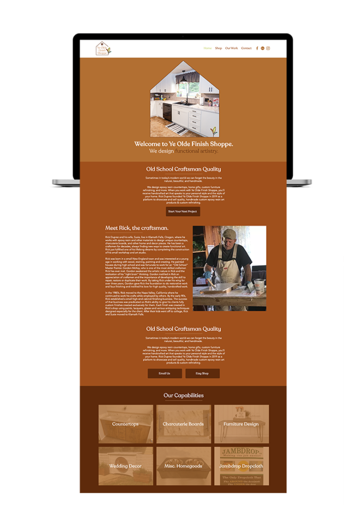
With Ye Olde Finish Shoppe’s website, I incorporated home details/graphics. This was essential to giving the website the same high-end but authentic, cozy feel that Rick’s creations have. Given that YOF Shoppe is a product-based business, we focused on the best ways to link customers to their products, and make the purchase process easy. This included details like linking to Etsy, making each page on the site link to the Shop page, and Wix’s easy-to-use checkout process. Because Ye Olde Finish Shoppe is a small business and needed the website update process to be easy, we decided to stick with the website platform they already knew how to use, Wix. However, Shopify is another great website platform for product-based businesses.
Want to learn more about the branding or website design process? You can contact me through my website in the contact form. An initial consultation call is completely free and I’m happy to answer your questions.
Leave a Reply Cancel reply
We respect your privacy.
Copyright Emily Foster Creative, LLC. 2021 - 2025. All rights reserved.
hello@emilyfostercreative.com
Brand photography by Lena Crocker Photo, Ciara Corin Photo, Moon & Honey Photography and Enliven Photography
Powered by podcasts and tea.
Designing out of Portland, Oregon for creatives around the world.

Be the first to comment