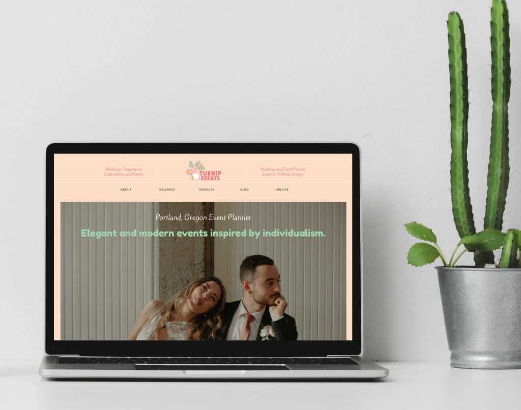
10 details to update on your wedding business website for engagement season

Out with the old, and in with the new! No matter where you’re at in your wedding business, the truth is, that there’s always room for improvement on your website, to make it more aligned with your business.
I get it, working on your own website can feel… well, blah. If you have a wedding business, you’re probably just starting to get a breath in after a busy year. While it’s nice to finally get some free time and look forward to the holidays and engagement season, this can also be an overwhelming time. For wedding vendors, it can feel overwhelming to feel like your wedding business is prepared. That’s why I put this website checklist together to help you set your wedding business up for success!
Here are 5 details to make sure you update on your wedding business website in time for engagement season:
1) An easy-to-navigate mobile website.
Many engaged couples – especially those without a full-service planner or parents’ help – are planning their weddings on-the-go, during lunch breaks, and more. Your website should be easy to read and navigate on mobile otherwise couples will leave before even taking a look at your offerings.
2) A linked phone number and/or email, or a well-designed contact form. Make it easy for engaged couples to click on your phone number or email and call or message your wedding business.
You would probably be surprised by how many vendors don’t do this! I specifically remember sitting in the car, on the way to a venue tour with my then fiancé (now husband!), and looking for photographers on my phone. A couple photographers didn’t have a mobile friendly contact form or a linkable email address on their site. In the moment, it seemed like too much work to copy and paste email addresses into my email app to ask photographers about their packages. Admittedly, I never returned to their websites and moved on to looking at other options when we got home. Increase your inquiries by making it easy for couples to email or call you directly (up to your preference of how you wish to be contacted).
3) A bio and picture that show YOU!
Weddings are a very personal business, and couples and decision makers want to see exactly who they’ll be working with. This is even more true if you’re a solopreneur. It’s vital to make it evident who that person is. This can show up on your Contact page, About page, or both. You don’t have to share your whole life story, but you should have at least 1-2 clear photos, and a bit of information about your motivations for starting your business, your experience, and what sets you apart from other vendors.
4) Crystal clear call to actions.
A call to action is the action that you’re asking your website visitors to take. Some examples are “Buy Now”, “Contact Us”, and “Learn More”. As a wedding business, your website should drive people to 1) learning more about your services and 2) reaching out to take the next step toward working with you. Make it clear about how they can schedule a sales call, book a tour, or reserve their wedding date with your business.
5) Describe what you offer.
This one sounds really simple, and it is, yet a lot of vendors tend to miss this. On your About or Pricing page, describe to couples what your packages include, including number of hours (if applicable), add-ons, and whether you bring an assistant. If you’re a venue, include your catering minimum or whether you allow outside catering, as well as small but additional charges that add up – like a bartender, napkins, tablecloths, additional hours, and more. Bonus points if you include the pricing of this on your website, because your couples will have the information they need prior to your call/tour, and you can both focus on whether you’re a good personality fit.
6) Update your copyright language on the footer of your website (update that bad boy to include 2024!)

7) Refresh your galleries with your newest, most quality work from the last year.
Be sure to optimize your images and add alt text to your images, too!
8) Update any outdated written information like old pricing, old systems and processes that you outline, or old Frequently Asked Questions.
9) Refresh your homepage through the lens of your developed client avatar.
Think through who your ideal client is and how they might have evolved since this time last year. Does your homepage accurately communicate to that person and make them feel seen?
Think about these questions:
- What matters most to them when booking a vendor like you?
- How quickly are they making their booking/purchasing decisions?
- What ways can you emotionally connect with them immediately and show the value you can offer them?

10) Analyze old blog posts and, where possible, update your content so that it’s still relevant to your audience.
I would focus on updating your old blog posts versus deleting old blog posts, but make sure they’re updated with modern information and dates, when relevant.
BONUS: Add a calendar to your website with your wedding date availability.
This one isn’t necessary, but it’s a tip that will save you even more time and help you attract the right clients. Couples will appreciate seeing your availability and this also creates a sense of urgency to reach out when they notice that your dates are quickly filling up.
Do you feel disappointed in your current website design, or feel like these tips are too overwhelming to implement?
Reach out and we can talk about a plan to get your website redesign done.
Leave a Reply Cancel reply
We respect your privacy.
Copyright Emily Foster Creative, LLC. 2021 - 2025. All rights reserved.
hello@emilyfostercreative.com
Brand photography by Lena Crocker Photo, Ciara Corin Photo, Moon & Honey Photography and Enliven Photography
Powered by podcasts and tea.
Designing out of Portland, Oregon for creatives around the world.

Be the first to comment