Website images tips for creative service providers.


Choosing images for your website is all about making a good first impression. Let’s make that impression stellar.
To have a successful online presence as a service provider, you absolutely need high quality photos that make people want to book with you.
If you’re stuck on how to choose images for your website, look no further. These are the tips I give my website clients when they’re stumped. With small businesses, I see one of three scenarios:
- They’re a newer business and don’t have a lot of photos to choose from.
- They’ve been in business for years and have hundreds upon hundreds of photos to filter through. Talk about decision overwhelm.
- They don’t have quality photos that showcase their best work, services or products.
If you fall into any of these categories, let’s go through how to select the best images.
Here are some general tips to consider for your website images:
- Make sure to choose photos that are relevant to your website and work. This will help communicate what your business does and create an inviting atmosphere.
- Choose photos that reflect your ideal client.
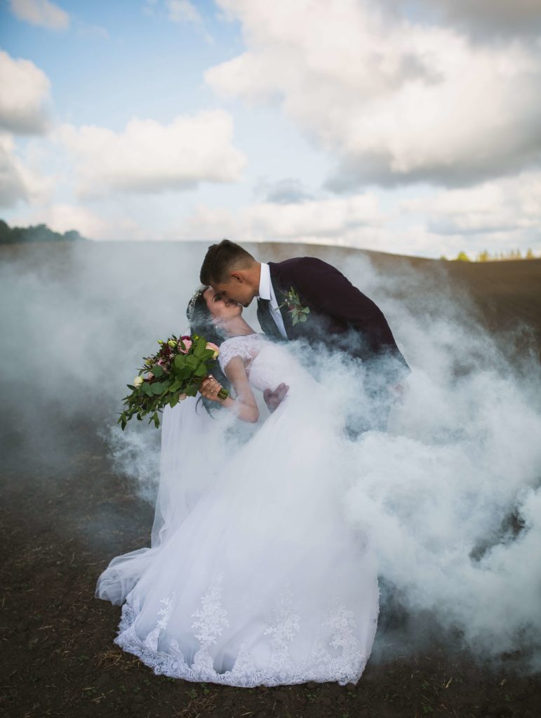
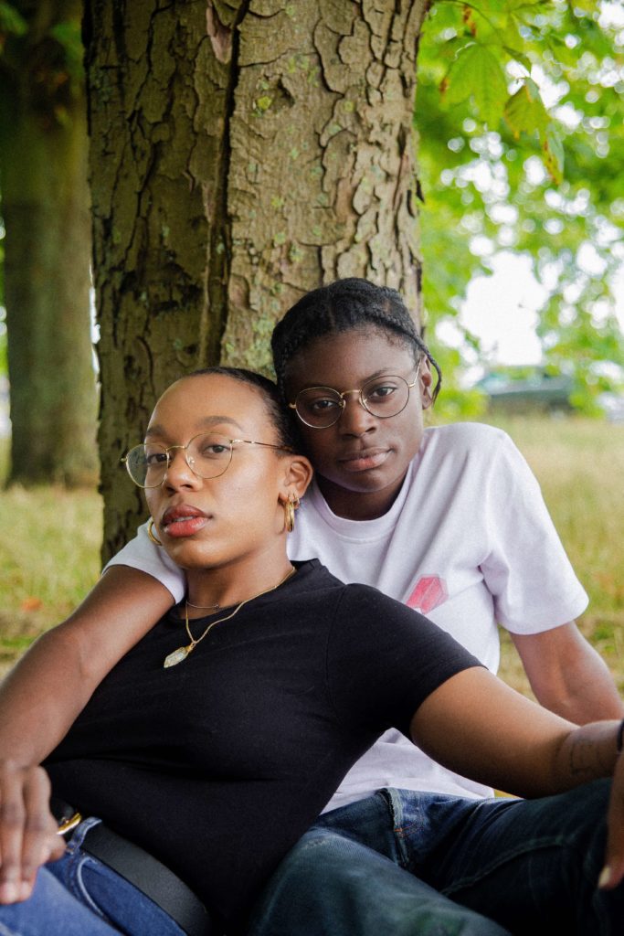
If you want to work with a specific niche, then please, for the love of making your potential client feel welcome, choose photos that look like your clients. Here are some examples for how intentional photography can be used to welcome in your ideal client:- If you want to work with LGBTQA clients, select photos that represent your LGBTQA clients, such as photos of queer couples, transgender clients, or people who identify as non-binary.
- If you want to work with interracial couples, choose more weddings from interracial weddings you’ve worked.
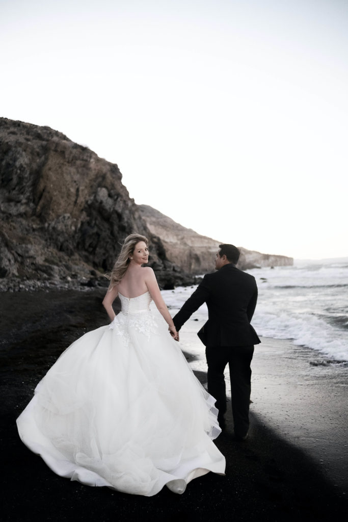
- If you want to book high-end weddings, choose only the highest quality, luxury weddings you’ve worked.
- This list goes on an on – if you want to brainstorm together, feel free to contact me!
- Use high-quality photos that are clear and sharp.
As a general rule of thumb, you want to use web-friendly images that are formatted in JPG, PNG, SVG, or WEBP. Google is starting to prefer .webp images, so if it’s possible for you to upload those types of images to your website platform, that would be great.
You also want to make sure that your photos aren’t too large. In general, make sure all photos on your website are less than 500KB – 750 KB each. For hero images (the large images near the top of your website pages), you can manage to choose photos that are slightly larger, but really try to keep all images to no more than 1MB each. You can use a free image compression tool like Tiny PNG to compress images, or if you’re a photographer, you can do this directly in Lightroom while you’re editing your work. - Choose photos that are visually appealing and stand out. Bright colors and interesting angles can help draw people in.
Of course, the exact style of your imagery depends on your business’s brand strategy and style. If you’re a wedding photographer who specializes in black and white film photography, you’ll want to choose images that align most with that style that you’re so good at. - Use photos that are unique and original.
Obviously, if you’re a photographer, only include your own work. If you rely on using another photographer’s work, ensure that you’re giving the photographer(s) credit either on each individual image, or on a photographer credit page, like this one for our past wedding venue client. - Don’t be 100% afraid of stock photography, but use it wisely.
It’s not wrong to use stock photography, but we recommend only using these photos as accents. For example, you can use patterns or fabrics in backgrounds. Avoid using stock photography that might lead website visitors to believe it’s your own work. For example, if you’re a florist, avoid using stock photos of flowers as potential clients might believe it’s your own work.
Make sure you credit the photographers if it’s required, and unless you’re willing to pay for stock photos, ensure that you’re using a legal-to-use free stock photo site.
Here’s How To Choose Images for Your Website based on each of the most popular pages:
Homepage Photos:
- Choose only your absolutely best photos. These should be the images that make people stop in their tracks and say “wow”. This is the page where most people will land first, so we basically want to advertise how amazing your work is before they navigate to the Contact, FAQs, or About page.
About Page Images:
This page should, of course, include photos of yourself. Here are some pro-tips specifically for creative business owners:
- Any photos of you in the midst of doing what you’re paid to do. This could include putting together flower arrangements, setting up a reception table layout at a wedding, officiating a ceremony, taking photos at a wedding, working at your computer, or sitting down with a coaching client. You can even include a video of your process, if you have an .mp4 file or a link to a video on Youtube or Vimeo.
- Personal content: your family and hobbies
If you feel comfortable showing your partner, kids, or pets, show them off! Your potential clients will love to see behind-the-scenes of your life, especially if you’re a soloprenuer. - A professional headshot
Professional headshots are great, especially if they’re branded to match the rest of your brand tone on your website. - Team photos
If you have members on your team, showcase their beautiful faces! Especially if you’re trying to come across as higher end, your potential clients will be delighted to see that you have professionals on your team who can help solve their problems and deliver quality service.
Portfolio/Gallery Photos:
- I would recommend you display 8-15 pictures of your most favorite work for your website. These should be the best, most high-quality photos you have, and you can always update them later! I’ll also potentially sprinkle these throughout other pages.
- If you’re a photographer or wedding vendor, focus on displaying at least 5 galleries of your favorite weddings/shoots. There’s no need to include every single photo from each wedding, but choose your top 10-15 photos per event and then organize those in a visually appealing gallery. It can be a tiled gallery, sliding gallery, or you can get more creative. Here’s how we laid out a gallery page for a wedding planner client.
Contact Page:
- A solid team photo or professional headshot is great for this page. If you have a really interactive photo, like a shot of you meeting with a client, then be sure to include that option as well.
Blog Photos:
- This could really be a whole blog post on its own, but if you’re a photographer or wedding professional, the blog is where your photos should live!
Be sure to share any and all photo shoots that you’re proud of. You
Check out more tips for your website photography in this blog post.
Have questions, or want help selecting your best website photos? Contact us.
Leave a Reply Cancel reply
We respect your privacy.
Copyright Emily Foster Creative, LLC. 2021 - 2025. All rights reserved.
hello@emilyfostercreative.com
Brand photography by Lena Crocker Photo, Ciara Corin Photo, Moon & Honey Photography and Enliven Photography
Powered by podcasts and tea.
Designing out of Portland, Oregon for creatives around the world.

Be the first to comment