

2026 Website Trends for Wedding & Event Pros
2026 website trends are everywhere right now, and if you’re a wedding or event pro coming back online after the holiday rush, it’s easy to feel like you should be doing all the things immediately.
Happy New Year, by the way. I truly hope you had a restful, peaceful holiday season, and I hope you’re easing back into work gently. This first full week of January can feel like a spiral: catching up, getting back into the swing of things, trying to “start strong,” and putting pressure on yourself to hit every goal on day one. If that’s you, I just want to offer a quick reframe: you don’t have to sprint into the year. You can build momentum through small, steady habits and a workflow that supports you long-term.
Which brings me to today’s episode and this post: website trends.
This is one of the first times I’ve ever made content that’s “trend-based,” because honestly… I don’t really believe in trends when it comes to your brand and your website, I love a meme, I love TikTok, I spend a lot of time on Instagram, Pinterest, all of it. I see trends all day long.
But I’m a strategy-first person (and studio). In a trust-focused industry like ours, I care a whole lot more about what’s going to help you book your ideal clients consistently than what looks “cool” for a season.
That said… I did do research with wedding and event pros in mind, and I cherry-picked trends that I actually think work in this space. So you won’t find every single 2026 trend under the sun in here. You also won’t find anything that feels gimmicky or distracting (for example: that retro “dial-up internet” aesthetic that’s making the rounds in design articles—fun concept, not the vibe for most of us).
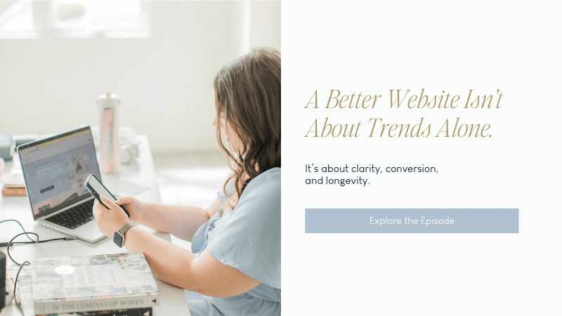
What you will find: trends that can elevate your website without sacrificing clarity, conversion, or timelessness.
If you want to listen while you work (highly recommend), you can tune in on Spotify or Apple Podcasts or play it directly here.
When website trends matter (and when they don’t)
Here’s the lens I want you to use for every “trend” you see this year:
Website trends matter when:
- They support your brand strategy
- They help you attract your ideal clients
- They align with your market positioning
- They improve the user experience
- They help tell your story more clearly and beautifully
Website trends do not matter when:
- You’re changing your site because you saw a competitor do it
- You’re changing things just to “keep up”
- You haven’t asked, “Does this actually serve my clients?”
- You’re spending time on aesthetics while ignoring the foundational conversion pieces
And this is important: if your website is constantly shifting and reinventing itself, it can actually create confusion for your audience. We want your brand to feel consistent and trustworthy. Fresh is great. Whiplash is not.
The conversion framework that never goes out of style
Before we talk “trends,” I want to anchor you in what still works, because none of the trends I’m sharing should replace this.
A high-converting website page (especially your homepage) should still guide people through a simple story:
- Problem: What your client is struggling with or what they want
- Solution: How you help and what’s possible with you
- Proof: Your work, testimonials, results, credibility
- Next steps: What to do now (inquire, book, apply, etc.)
There’s so much flexibility in how you design that flow. It doesn’t have to look like a cookie-cutter template. But the psychology behind conversion doesn’t change: we’re building trust, clarity, and forward motion.
A few “not trendy,” but essential website reminders for 2026
These aren’t the fun part, but they matter so much. If you’re going to spend time on your website this year, I’d rather you start here before you worry about anything aesthetic.
Mobile-first is still non-negotiable
In most cases, the majority of your traffic is coming from mobile. Check your analytics if you want proof, but I can almost guarantee it.
Your site should be:
- easy to scroll
- easy to read
- easy to navigate with a thumb
- easy to tap (buttons, links, menus)

Tap-friendly navigation
On mobile, your menu should be intuitive and clean. If your navigation is hard to find, hard to close, or tiny to tap, people will leave faster than you think.
Quick check: pull up your website on your phone and try to navigate it like a client would. If it feels annoying for you, it definitely feels annoying for them.
Pop-ups: keep them minimal (and easy to close)
I’m not anti pop-up, but I’m very pro “calm experience.”
If you use a pop-up:
- keep it small (especially on mobile)
- make the X obvious and easy to tap
- avoid full-screen interruptions whenever possible
- make sure it doesn’t block someone from finding what they came for
We are not Amazon. We are not a fast retail conversion. Most of you are selling an experience that starts at $1,500–$2,000 and often way above that. The energy should feel intriguing, warm, clear, and trustworthy, not pushy.
SEO best practices still apply
Even as things evolve, the basics still matter:
- page titles + meta descriptions
- keyword research
- heading structure
- alt text
- clean, readable page organization
And yes, we’ll talk about how AI is changing the SEO conversation, but it’s not replacing the fundamentals. It’s building on them.
Update your website footer for the new year
This is your friendly reminder to scroll to the bottom of your site and update your copyright year to 2026.
It’s small, but it’s one of those details that signals your business is active, current, and cared for.
Pricing visibility is becoming even more important
I know this is a hot topic, and you get to run your business the way that makes the most sense for you. I’m not here to shame anyone who keeps pricing off their site.
But I am going to tell you what I’m seeing: more people want pricing clarity faster, and that shift is only increasing.
If you can:
- include starting pricing on your services page
- include ranges
- include “most clients invest ___”
- include quick FAQ pricing context
If you truly can’t:
- give a fast path to access pricing (a guide, an email automation, a quick form)
- set expectations early so people aren’t surprised later
In a world where people are more budget-conscious and younger clients value transparency, we want to reduce friction wherever we can.

2026 website trends in content and messaging
Now we’re getting into the fun part. Let’s start with trends that are less about aesthetics and more about how your website communicates and converts.
AI-optimized content (not instead of SEO, in addition to it)
More people are searching through AI tools now, and Google itself is showing AI-style summaries for many queries. That doesn’t mean “SEO is dead.” It means your content needs to be structured in a way that’s easy for both humans and machines to understand.
What helps:
- clear headings
- specific questions + answers
- organized long-form content
- well-written services pages that truly explain what you do
Structured FAQ sections
I’m seeing structured FAQs becoming even more valuable in 2026 because they do two things at once:
- they reduce hesitation for clients
- they help your site show up in search (traditional + AI-supported search)
Your FAQs should be real questions your clients actually ask, like:
- “How far in advance should we book?”
- “What happens if it rains?”
- “Do you travel?”
- “How much customization is included?”
- “What’s the process like after we inquire?”
A “text-heavy” services index page (simple, strategic, powerful)
One of my favorite pieces of advice I’ve heard from SEO experts is to create a page that’s basically a clear, text-forward breakdown of:
- what you do
- who you serve
- where you work
- what services you offer
- what problems you solve
Not overly designed. Not fancy. Just information-rich and well organized.
Think of this as a helpful directory page that supports your site’s visibility and clarity.
Longer-form service pages that answer real questions
In 2026, “pretty but vague” is not going to outperform “clear, confident, detailed.”
Your services pages should help someone:
- understand what you do
- understand what it feels like to work with you
- understand the transformation you offer
- understand what happens next
This doesn’t mean dumping a 25-bullet list of deliverables. It means presenting your offer with structure and intention, so your client can move from curiosity to confidence.
Testimonials that tell a story
Quick testimonials are fine, but the ones that convert are the ones that show transformation.
Look for testimonials that include:
- how they felt before working with you
- what changed during the process
- what the experience was like (communication, support, planning, expertise)
- what the result felt like emotionally
If you want better reviews, prompt better reviews. When you ask for a testimonial, consider asking:
- “What were you worried about before we started?”
- “What was the biggest relief you felt?”
- “What moment stands out from the process?”
- “What surprised you the most?”
Video testimonials (keep them natural)
Video testimonials can be incredibly powerful in a trust-based industry, but the key is: don’t over-produce them.
If it feels scripted, it loses the magic.
A casual, authentic video clip with real emotion will outperform something overly staged every time.
Galleries curated by story or experience
This is such a good one for wedding and event pros.
Instead of organizing galleries only by couple names, consider:
- galleries by venue (great for photographers, planners, florists)
- galleries by experience (“The Celebration,” “The Quiet Moments,” “The Details”)
- galleries by vibe (“Modern editorial,” “Romantic garden,” “Classic ballroom”)
This helps clients picture themselves in the experience, not just look at someone else’s wedding.

2026 website trends in design
Now we’re talking visuals. These are trends I’m seeing requested more often, and I think many of them can be incorporated in a way that still feels timeless.
Micro animations
Micro animations are subtle movement elements that add life without overwhelming the user.
Examples:
- hover effects on buttons
- text fading in as you scroll
- gentle transitions
- parallax scrolling (when done carefully)
- small animated lines that guide the eye
The key is subtle. Movement should support clarity, not distract from it.
Cinematic clips that autoplay muted
I love a muted cinematic video moment on a homepage. It can instantly elevate the feel of your site and help people understand your work in a heartbeat.
If you include video:
- keep it muted by default
- let the user opt into sound
- keep file sizes optimized so your site stays fast
If audio is essential to your business (DJ, band, musician), you can still do this beautifully—you just want to avoid surprising someone with sound the second your site loads.
Behind-the-scenes moments
More and more, people want to see what it’s actually like to work with you.
Behind-the-scenes photos and video can show:
- how you set up
- how you lead
- how you care for your clients
- your process in action
This builds trust fast, especially for service-based businesses.
Textures and layering
Texture adds dimension and depth. This can be:
- subtle fabric textures
- paper grain
- soft overlays
- patterns
- layered design elements that make a site feel more tactile and editorial
It’s a small detail that can make a website feel more elevated.
Maximalism (when it fits your brand)
We’re seeing a shift away from “everything must be beige and minimal.”
Maximalism doesn’t have to mean messy. It can mean:
- bold color moments
- layered photo collages
- richer typography
- playful design choices
- a more expressive visual identity
If your brand is more classic and timeless, you can still incorporate hints of this without changing your whole direction.
Anti-grid layouts
Some websites are moving away from perfectly boxed layouts into designs that feel a little more editorial and dynamic.
Think:
- overlapping elements
- asymmetry
- unexpected placement (but still intentional)
- layout that feels designed, not templated
This can be a really beautiful way to feel more high-end while still keeping the user experience clean.
Bold palettes (less “safe neutral”)
Color is coming back, and I’m here for it.
If bold color fits your brand strategy, don’t be afraid to use it with confidence. If it doesn’t, don’t force it. This is where trends can tempt you into making a change that doesn’t actually serve your positioning.
“Cute-alism” (yes, that’s the name)
This is a trend I saw referenced in design trend research, and it’s exactly what it sounds like: playful, whimsical, slightly cartoon-ish visual elements.
This is not for everyone. Most wedding pros probably won’t go full “cute-alism,” but for the right brand, it can be magic.
This could look like:
- doodle-style icons
- sticker-like graphics
- playful illustrations
- joyful typography choices
If your brand has that energetic, fun, personality-forward vibe, this is a trend worth exploring.
Human scribbles and hand-drawn elements
This trend makes sense as a push toward “human” design in an AI-heavy world.
Hand-drawn circles, underlines, sketchy accents, imperfect lines—these elements can make a website feel more personal and custom.
Frosted glass panels and soft gradients
This is a more modern, layered look:
- frosted overlays
- subtle shadows
- diffused backgrounds
- gentle gradients
It’s a trend that can feel tech-forward if overdone, but when it’s softened and applied intentionally, it can still feel romantic and elevated for wedding and event brands.
Adaptive experiences (lightweight version)
When you hear “AI-powered website,” it can feel intense and unnecessary for a small business site. And honestly, most of you don’t need anything complicated.
But the principle behind adaptive experiences—creating a more customized user journey—can be done in simple ways, like:
- quizzes that guide visitors to the right service
- interactive “choose your experience” buttons
- a search bar for your blog
- pathways for different client types (weddings vs corporate, local vs destination, etc.)
Customization is only becoming more important, especially for younger audiences who are used to personalized digital experiences.
What to do next (so you don’t feel overwhelmed)
If you take nothing else from this, take this:
Keep your conversion flow strong:
- Problem
- Solution
- Proof
- Next steps
Then, choose one or two trends that support your strategy and implement them well.
You do not need to incorporate every trend, you do not need to reinvent your brand, you do not need to rebuild your website every year.
The goal is a business that lasts, not a website that wins “trend of the month.”
Want help implementing these trends?
If you’re reading this and thinking, “Okay… I love these ideas, but I need help choosing what actually fits my brand,” you have options.
In 2026, we’re offering:
- Website design (full builds for brands that need a strong foundation)
- Website refreshes (updates that elevate without starting from scratch)
- VIP Days returning in a new format (not a full multi-page website build in a day, but a focused refresh for key improvements)
- Website maintenance retainers (monthly or quarterly support for updates like refreshing galleries, adding new pages, keeping things current)
If you want a smaller, actionable starting point, you can also book a website audit with me. It’s a $300, one-hour session where we go through your site and I give you a recording + a clear list of next steps.
And if you want a free resource: grab my Elevated Website Checklist (it’ll be linked in the show notes).
Final thoughts
I hope this felt fun and energizing, not overwhelming.
If you want to embrace trends in 2026, I’m all for it—just don’t let trends replace strategy. Let them enhance what’s already working.
You’re building trust, you’re building longevity, you’re building a business that deserves a website that works just as hard as you do.
And if you’re easing into the year slowly, I’m cheering you on. That’s not laziness. That’s sustainable growth.
Listen to the episode
You can listen on Spotify or Apple Podcasts or play it directly here.
If you want to tell me what trend you’re most excited about, come say hi on Instagram. I’d genuinely love to hear.


Be the first to comment